As one of my hobbies I am a participant in NASPA
(North American Scrabble Players Association)
tournaments. One of the questions that I had posed to me
before is whether there is a way to fairly handicap the
difference in scores between two players given their NASPA ratings
this page is designed to show the analysis that I put into the problem.
Special thanks to Seth Lipkin and Keith Smith for their excellent
website www.cross-tables.com, and the associated REST API where I was
able to download all of the data needed to perform the analysis.
To start the analysis I downloaded the results of all tournament
Scrabble games from the start of 2013. I then further culled the
data to only include games using the North American Word List (OCTWL)
(there are also tournament games using the international word listing (CSW)
but I wanted to compare apples to apples), and games where both players had
a recorded score, and an established rating (newcomers had a rating of 0 in
the database).
Once I had the underlying data of 216,294 scrabble games I then transformed
the data to make it into an observation for each player in the game. This
doubled the number of records, but also "mirrored" the data since if one
player is rated 100 points above the other one, and wins by 30 points then
there should also be a record where a player is rated 100 points below the
other one, and loses by 30 points. When the players have the same rating
then the expected difference in score should be estimated as zero, due to the
two records canceling each other out statistically.
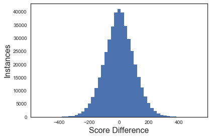
As a starting point we can check some assumptions. The difference in score
should be normally distributed around 0.
The difference in rating should also be normally distributed around 0.
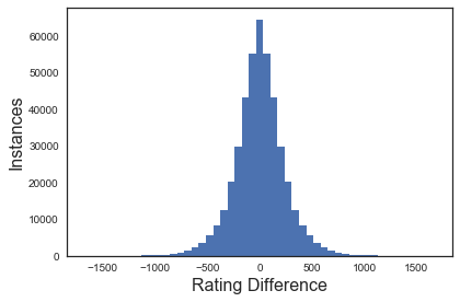
So far so good. Now we can look at a scatter plot of all of the points
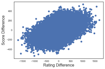
Woah! It looks like there is a pattern here, but there are a lot of points
overlapping each other. We can try a different size of marker to see if that
makes things any clearer.
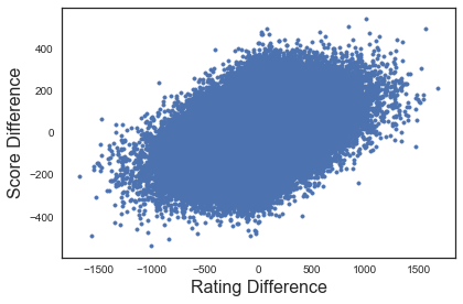
Although that makes the outlying points a little bit clearer, there still
seems to be a big blob in the middle. Another technique that is often used is to
make the marker a hollow circle. That way you can still see some of the overlap
in the markers.
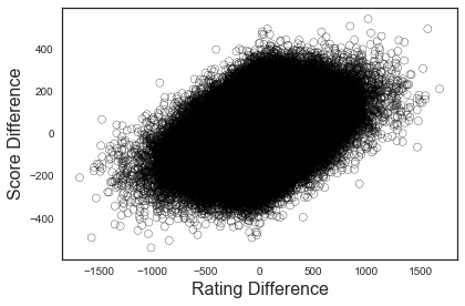
Still clear as mud. It looks like we have to take another tack to show the
pattern in the data. What if I told you there is a chart type in Python (through Seaborn)
that incorporates all of the charts that we have calculated so far, and allows us to see
values for overlapping points? Enter the jointplot!
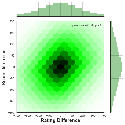
Using the jointplot, we can show (through the bar charts on the outside of the graph)
that the data is normally distributed for both variables. The shade of the "hexes" on
the inside of the graph shows the concentration of values that lie within the hex.
The darker the hex, the more values that lie within it. Closely related to this
hex jointplot is the kde (kernel density estimation) graph:
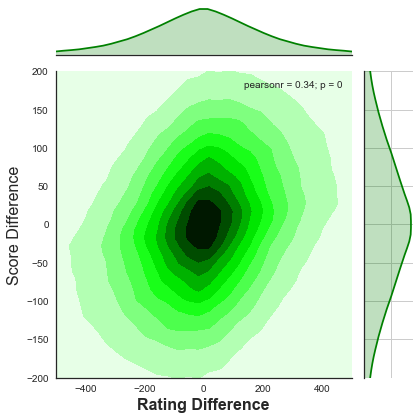
The kde graph may be familiar to those of you that have seen topographical maps
before. The darker the shading the greater the number of records within the circle.
Both of the above graphs seem to still show a positive correlation between difference
in score and difference in rating. We can now do a linear regression on the data to
obtain a formula.
When we run the linear regression, we obtain a formula of:
Expected Score Difference = Rating Difference * 0.14366
(There is no intercept since, as was stated before, the data is mirrored, so the
line of best fit should go through the point (0,0)).
We can also obtain the R2 value for the data. For a perfect model the R2 value
would be 1. The R2 value for this data is 0.117585. That is not very good.
To find the reason for this, we only need to look at the variance in the values.
The mean squared error from the linear regression line for the records is 8782.983
Taking the square root of this number gives us the standard deviation: 93.718 points!
Using normally distributed values, 68% of values should lie within 1 standard
deviation, and 95% of values should lie within 1.96 standard deviations. That means
the range for 95% confidence is our Expected Score Difference +/- 183.69 points.
That is a huge range! No wonder why the R2 value is so poor!
One area to look at for a better model is the fact that difference in rating is
not a linear relationship to what percentage of games are supposed to be won, but
rather a logorithmic relationship. For those of you that follow ratings, it is
very close to the Elo model. The formula for the expected win percentage is:
E Win % = 1 / (1 + e ^ (-0.0031879 * Rating Difference))
We can map this relationship using a jointplot, and compare the statistics:
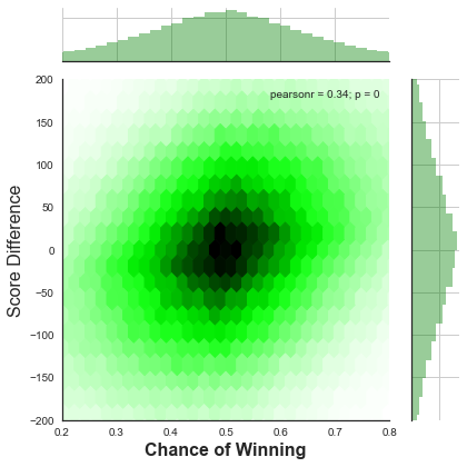
Hmm, there seems to be more variation in this plot. If we check the
R2 for this transformed data, it is marginally worse than for the other
plot, and the standard deviation is also marginally higher - meaning that
this model is worse than our original model!
Another item to check is whether we could transform the difference in rating
by squaring it or cubing it to create a better model. If so then there should be
a relationship between our residual values and the difference in rating. Once
again we can start out with a scatter plot:
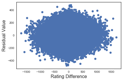
Back to a big blob again. Let's put the residuals into a jointplot:
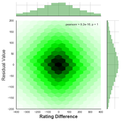
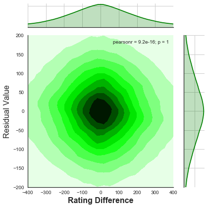
Looking at the bar graph on the right hand side, we can see that the
residuals are normally distributed (as they should be if the data does
not need another variable to explain it). The "p" score in the graph
is 1 which means that there is no relationship between the difference
in rating and the residual values - which we would expect if we wanted
to add a variable raising the difference in rating to a higher power
that one.
Conclusion: If an handicap is needed then the formula of 0.14366
times the difference in rating is as good as any, but it should not
be used for anything serious due to the large amount of variance in
the data.